Case study • keyone host portal
The keyone
host portal
A web app for holiday-home owners to manage their properties, centred on a modular onboarding survey that fed 40+ booking platforms.
The challenge
Turning what an owner knows into what booking platforms need
keyone runs hotels and holiday homes across the Austrian Alps. Its holiday homes belong to private owners, who hand keyone the work of renting them out.
When keyone signed a new holiday home, someone from the company visited the property, collected information about it, and onboarded it into our operations system. From there, listings for the property went out to more than 40 booking platforms, including Booking.com, Airbnb, and HomeToGo.
keyone’s account managers, who onboarded each new holiday home, faced a torrent of repetitive questions about every property. With no standard approach to the free-text fields, the shape of the information varied with each one’s approach.
The host portal’s goal was to give that job to the person who knows a property best: its owner. That meant asking questions in terms an owner would understand, and collecting answers that could be sorted into the operations system’s fields. Account managers stayed involved, but to review answers, not to supply them.
Key terms
keyone’s systems called each building a parent asset, and each holiday home inside it a child asset. A house would often be one parent with one child, and an aparthotel one parent with several. The rest of this case study uses the same terms.
What the survey had to handle
- Dozens of questions for each building, dozens more for each child asset, and an amenities checklist on top.
- Child assets under the same parent asset could be near twins, so owners would be answering the same questions again and again.
- The whole survey was more than one sitting’s work, so owners needed to be able to save, leave, and pick up where they left off.
Who the owners were
Holiday-home owners, not hoteliers. They ranged from someone with a single furnished flat or house to someone with an aparthotel of up to a dozen apartments, though most had between one and six. Owners often lived elsewhere, but some lived on or near their property.
Sorting a sprawl of possible questions
Our project manager compiled and organised every input the operations system needed. I went through each question and its answer format, looking for ones we could merge, drop, or move. Once I’d finished, the project manager checked each suggestion against how the operations system used the answer, to make sure it still worked.
Along the way, I rewrote the questions in plainer English, and gave editorial feedback on the German copywriting.
The survey came out roughly a fifth shorter, but the bigger change was the organisation. The original list ran across several pages and categories. I regrouped the questions by theme, so related ones sat together and owners only had to think about one part of their property at a time.
How the survey was split
- Once per building
- The parent asset: features, operations, booking, and extra information.
- Once per child asset
- Each child asset: operations, and facilities and location. Child assets unlock once the building is done, since some of their questions depend on its answers.
- All at once
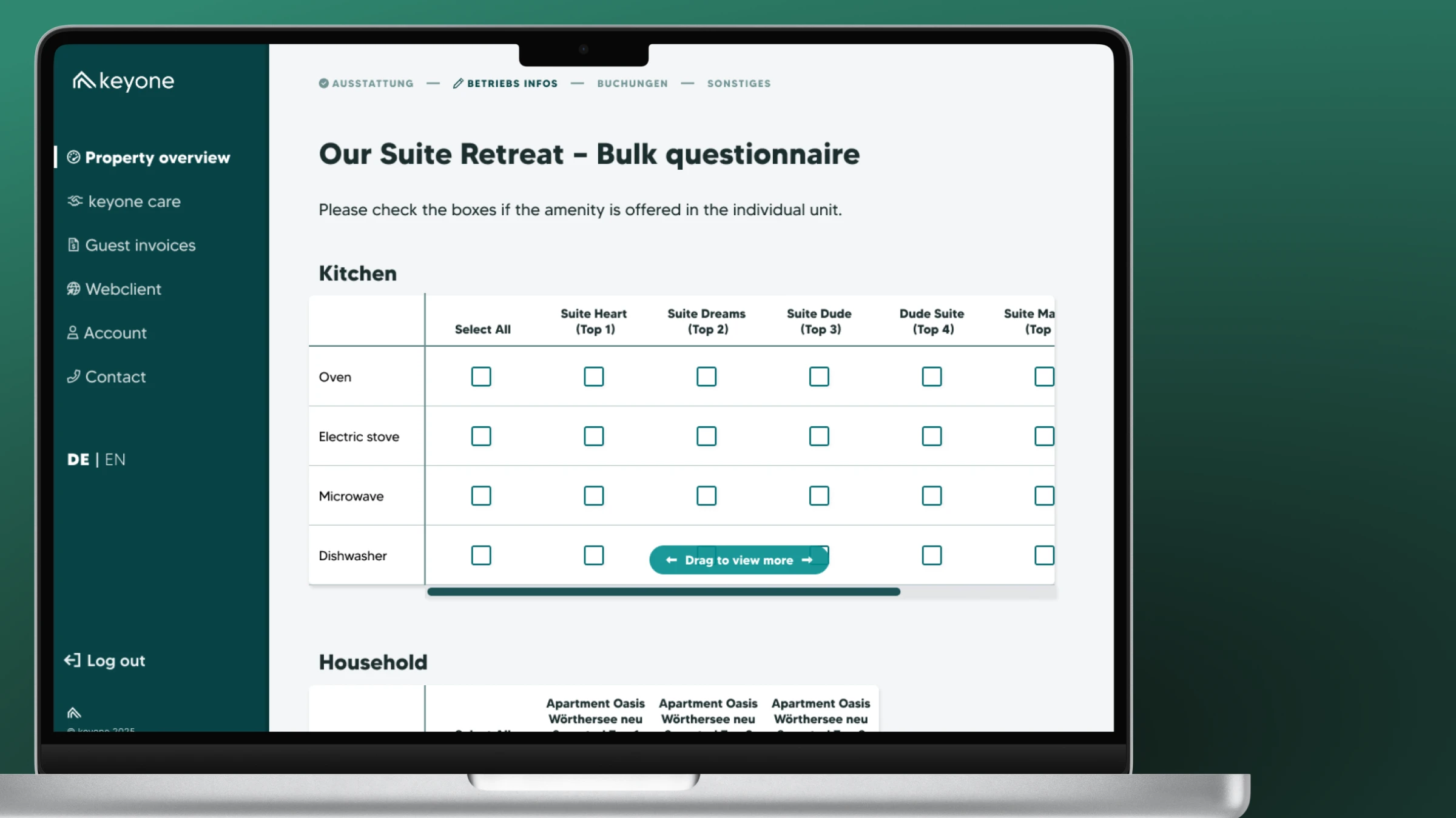
- Bulk amenities: kitchen, household, bathroom and hygiene, and more, each as a grid of yes-or-no questions with a column per child asset.
Where owners started
Account managers set up each owner’s parent and child assets, so on first login, owners landed on an overview of their properties. Anything still waiting on input was flagged, with a prompt to start or finish it.
A survey built from parts
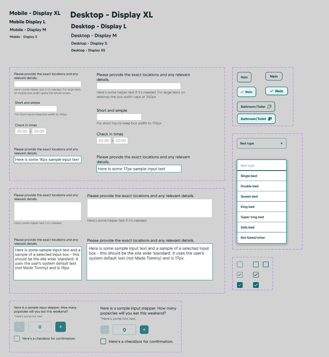
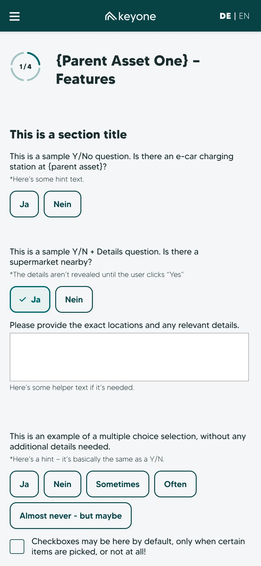
Every question was assembled from a library of components I designed, including text fields and their variants, number inputs, yes-or-no choices, and multiple choice. Most survey questions were built from a combination of existing parts.
-

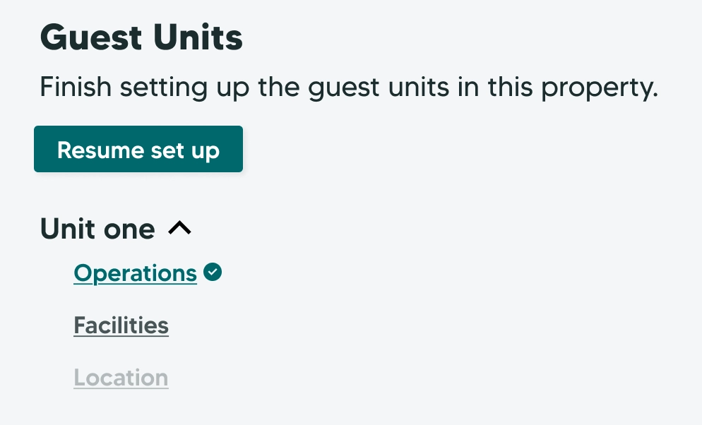
The progress bar shows which section of the survey an owner is in, which are finished, and what’s still to come.
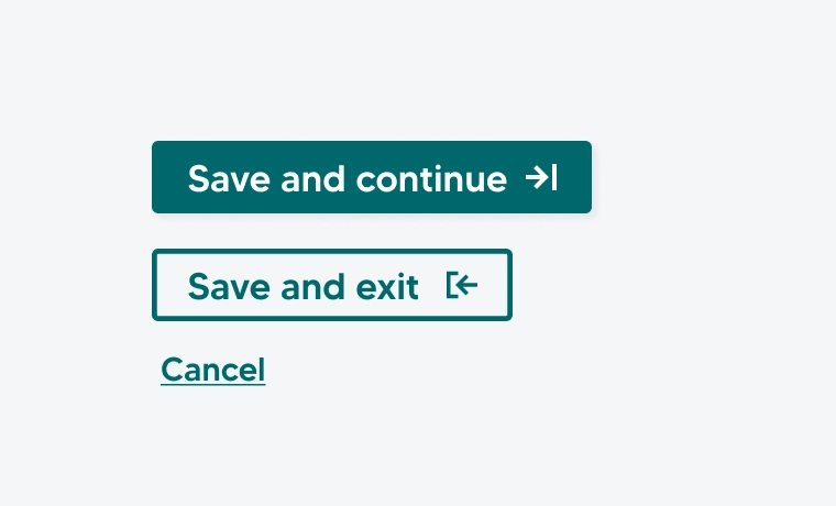
At the bottom of each section, owners could save and continue, or save and exit and come back later. Their progress showed on the onboarding overview.
Prototyped and cut: a sticky bottom bar
-
Early wireframes pinned a bar to the bottom of the screen, with cancel and exit, the next child asset, and progress. Once I prototyped it, it was clear that it mostly got in the way. Progress moved to a slim bar at the top, and the save buttons to the end of each section. That left the owner’s attention free for the questions.
Cutting out repetition
Owners faced a lot of questions. If each child asset had 40, an owner with four of them faced 160 answers, before the parent asset’s questions and the amenities checklist. Two features cut the load: copying answers between similar child assets, and checkbox grids for the amenities.
Copying answers between similar child assets
Child assets under the same parent asset could be near twins, fitted out and run the same way. From the second child asset on, each section could be filled by copying it from one already done. For example, if apartments one and three are near twins, the owner could copy apartment one’s operations section into apartment three, then only answer questions about unique details.
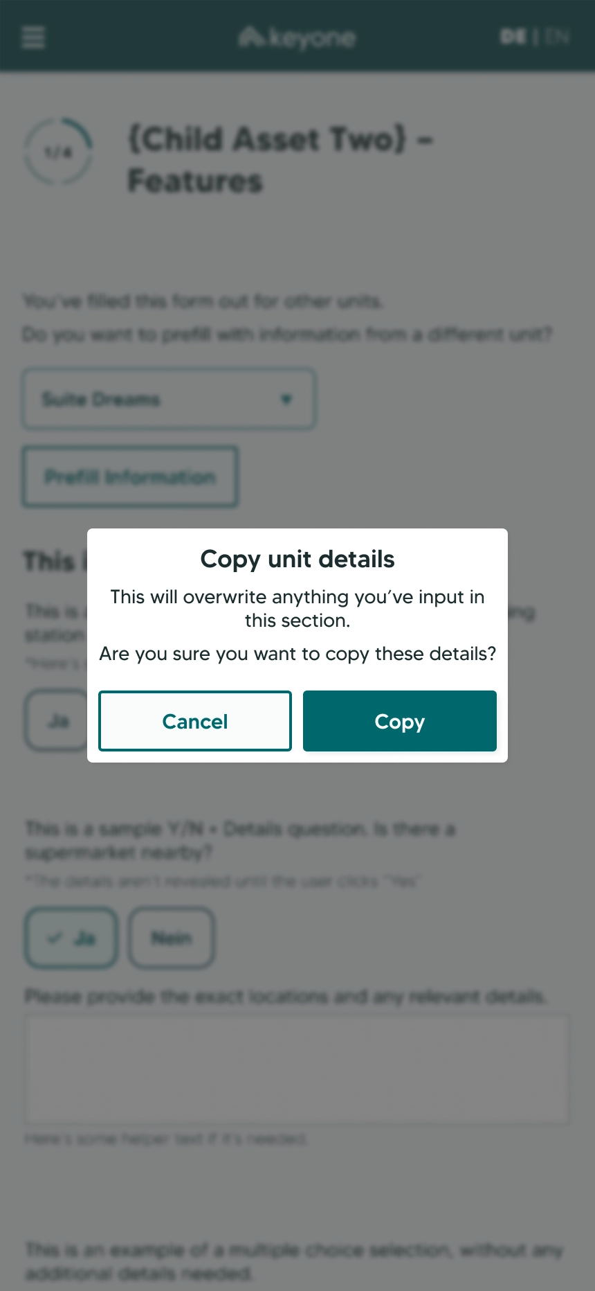
Copying is fast, which made it risky: owners could copy from the wrong child asset, or accept answers without reading them. So a copied section arrived like the review screen at the end of the survey: answers as plain text, quick to skim, each one editable on its own, and a checkbox to confirm the section had been reviewed. Nobody had to comb through 40 answers, but nobody could accept a section without looking at it.
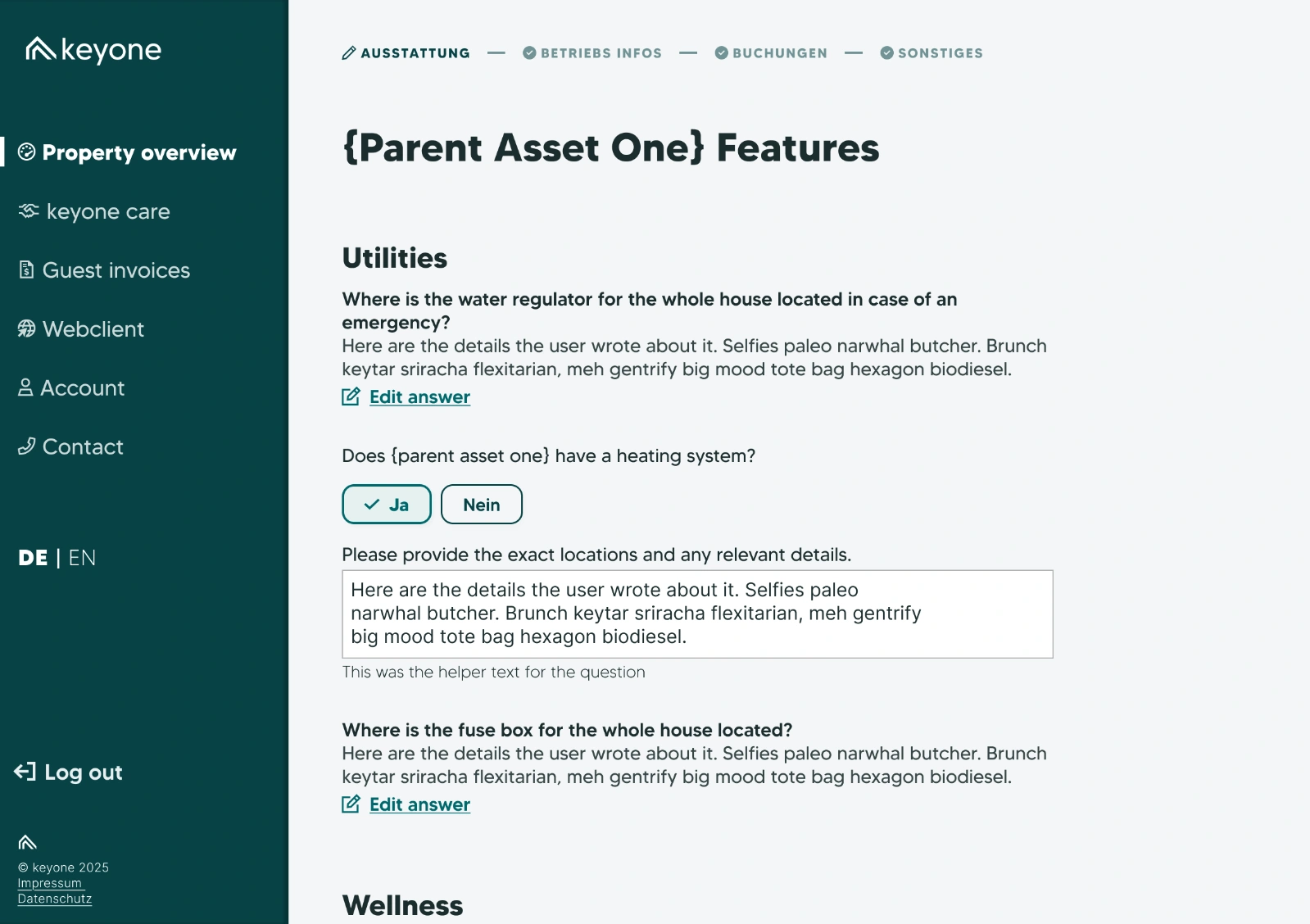
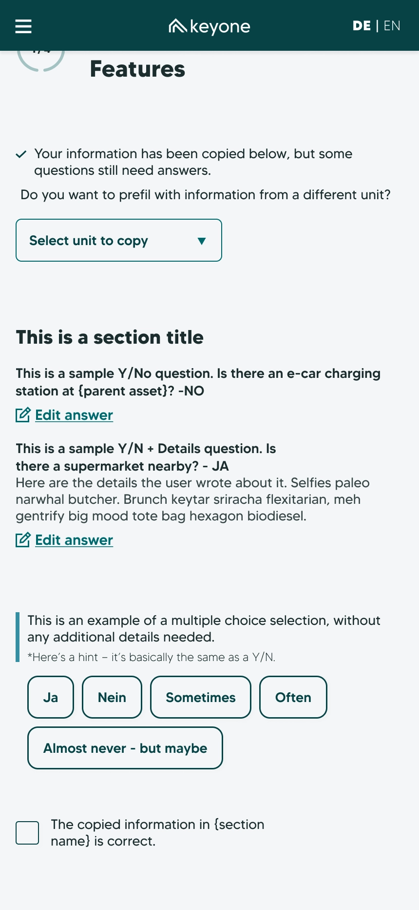
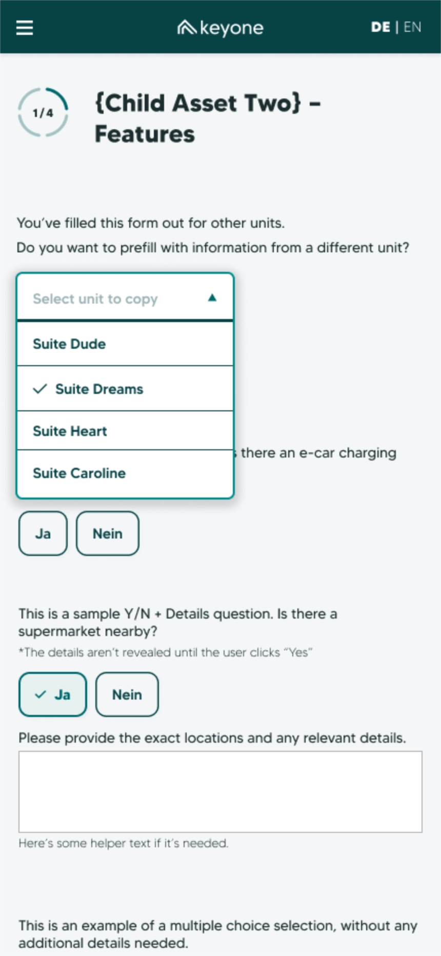
How copying worked, step by step
- Choose
- A dropdown lists the child assets already done. The owner picks one and copies.
- Confirm
- A warning makes clear that copying will overwrite any answers already in this section.
- Check
- The section arrives as a plain-text summary. Questions specific to this child asset stay as fields to fill in.
- Accept
- A checkbox at the end of each section is required to confirm the owner has reviewed it.
Amenities in grids
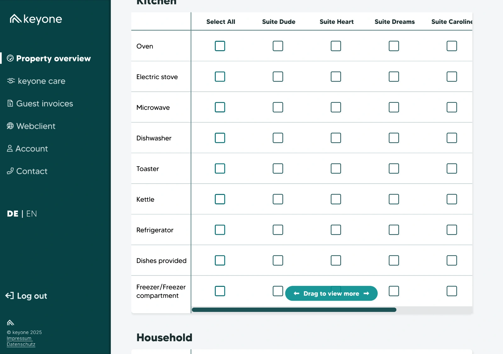
The amenities were the quickest questions in the survey. Does the apartment have an oven, a kettle, a hairdryer, a bathtub? They didn’t need the yes-or-no components, so each category went into a checkbox grid, with a row per amenity, a column per child asset, and a select-all. Owners with more child assets than fit across the screen could scroll the grid sideways, and a scroll hint, a translucent pill at the bottom edge, showed they could drag for more.
Describing a home, room by room
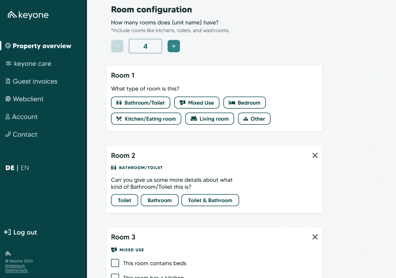
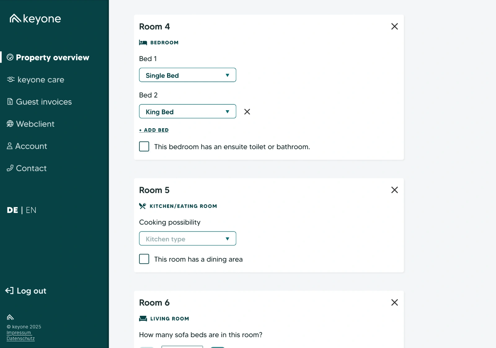
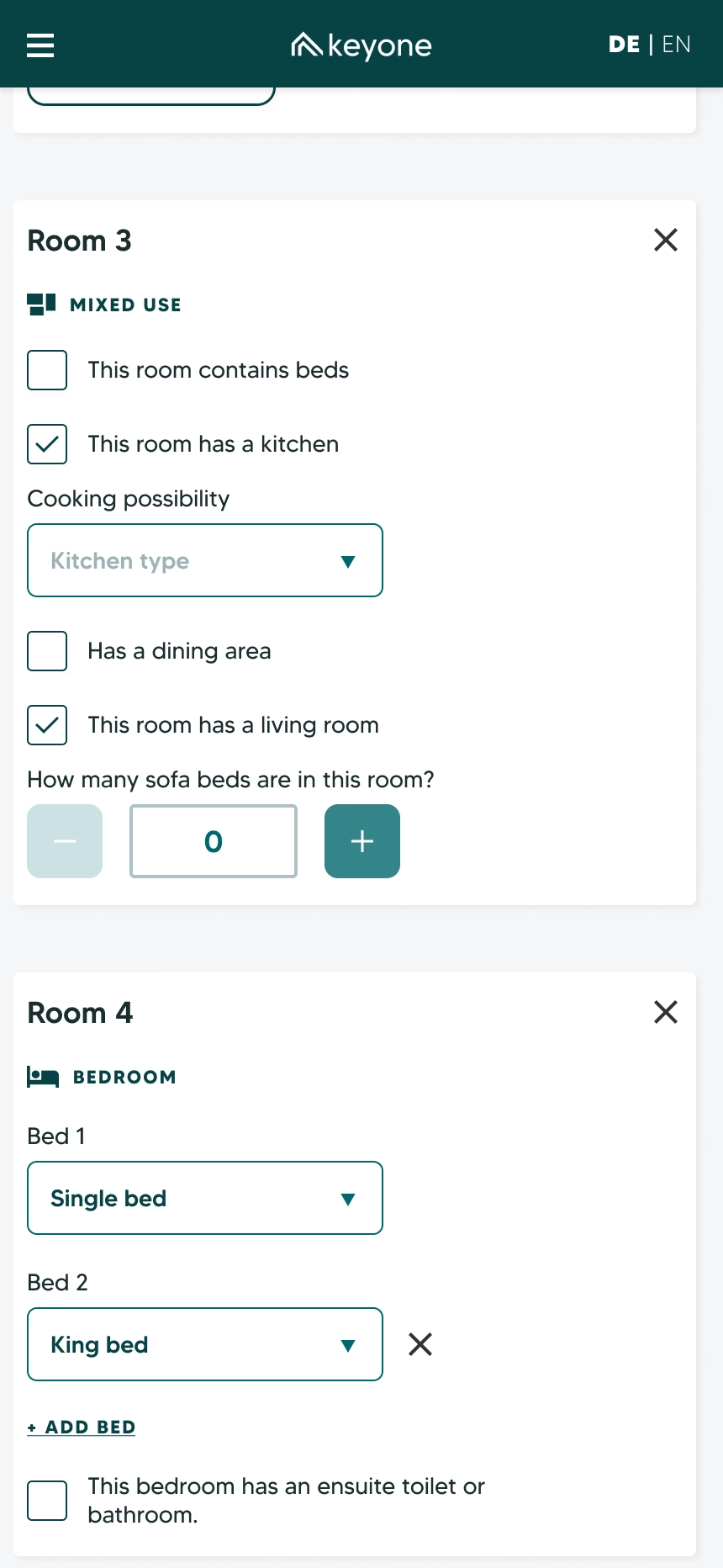
Several booking platforms wanted each child asset’s room configuration, but each wanted a different slice of it, and some questions only mattered to one platform. Rather than bolt on a long extra set of survey questions, the survey had owners describe their home one room at a time. Every platform’s answers came out of that one picture.
The build-a-home workshop
- How many rooms
- A number field, starting at one. Each room added becomes a card below.
- What kind
- Bathroom, bedroom, living room, kitchen and dining, mixed use, or other.
- The details
- Each room type brings its own questions. Once every card was done, they added up to a clear picture of how the child asset worked.
I prototyped the whole flow and tested it internally, though not with owners.
Side quest
Finding and downloading invoices
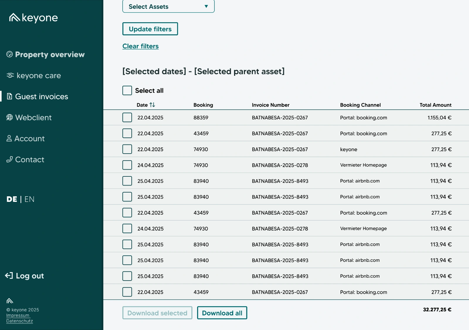
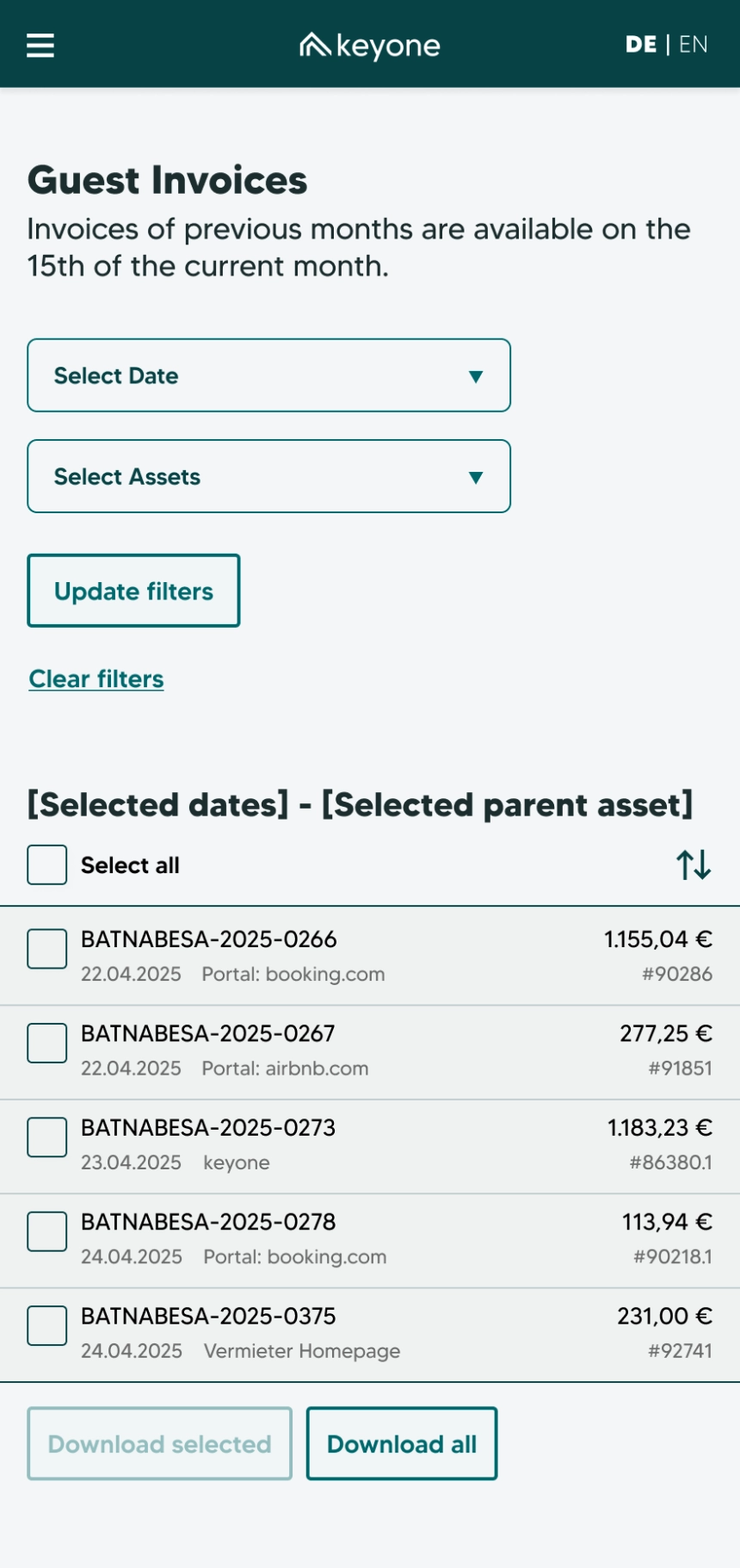
As the onboarding survey designs were wrapping up, I was briefed on a corner of the portal where owners could view and download their invoices.
Owners pick a date range and the properties they want, and get a list showing each invoice’s date, amount, number, booking platform, and name. Selection controls let them download one invoice, several, or all at once.
On a phone, the list scrolls in its own window inside the page. On desktop, it simply grows down the page without pagination, since no owner was expected to have a huge number of invoices. It never got tested, and I’d still like to explore whether there was a better solution.
Reviewing the first build
Handoff started in late spring 2025, with the desktop screens marked ready first. Design and development worked separately at keyone, and apart from one call during handoff, I didn’t see the product again until the first build came back that autumn and I was asked for feedback.
It was a much smaller product than the one designed. Copying between child assets hadn’t made it in, and neither had the room configuration flow. I audited the whole build for usability and accessibility.
How I organised the feedback
I sorted every issue into three tiers, working with Claude to help structure and prioritise the list, so the team could see what had to happen before launch and what could wait. I also gave each issue an effort estimate, from quick wins to deeper fixes, drawing on my time as a product owner at Bright IT.
- Critical
- Fewer than ten issues that would stop owners finding their way through the survey. We couldn’t launch until they were fixed.
- Core
- About 10 to 15 issues of poor usability or accessibility. They wouldn’t stop a launch, but they’d make the survey harder to use.
- Polish
- Another 15 to 20 small, non-essential issues, from visual polish to minor usability. Flagged, but not expected to be fixed before launch.
Examples from the audit
Critical: validation errors nobody could find
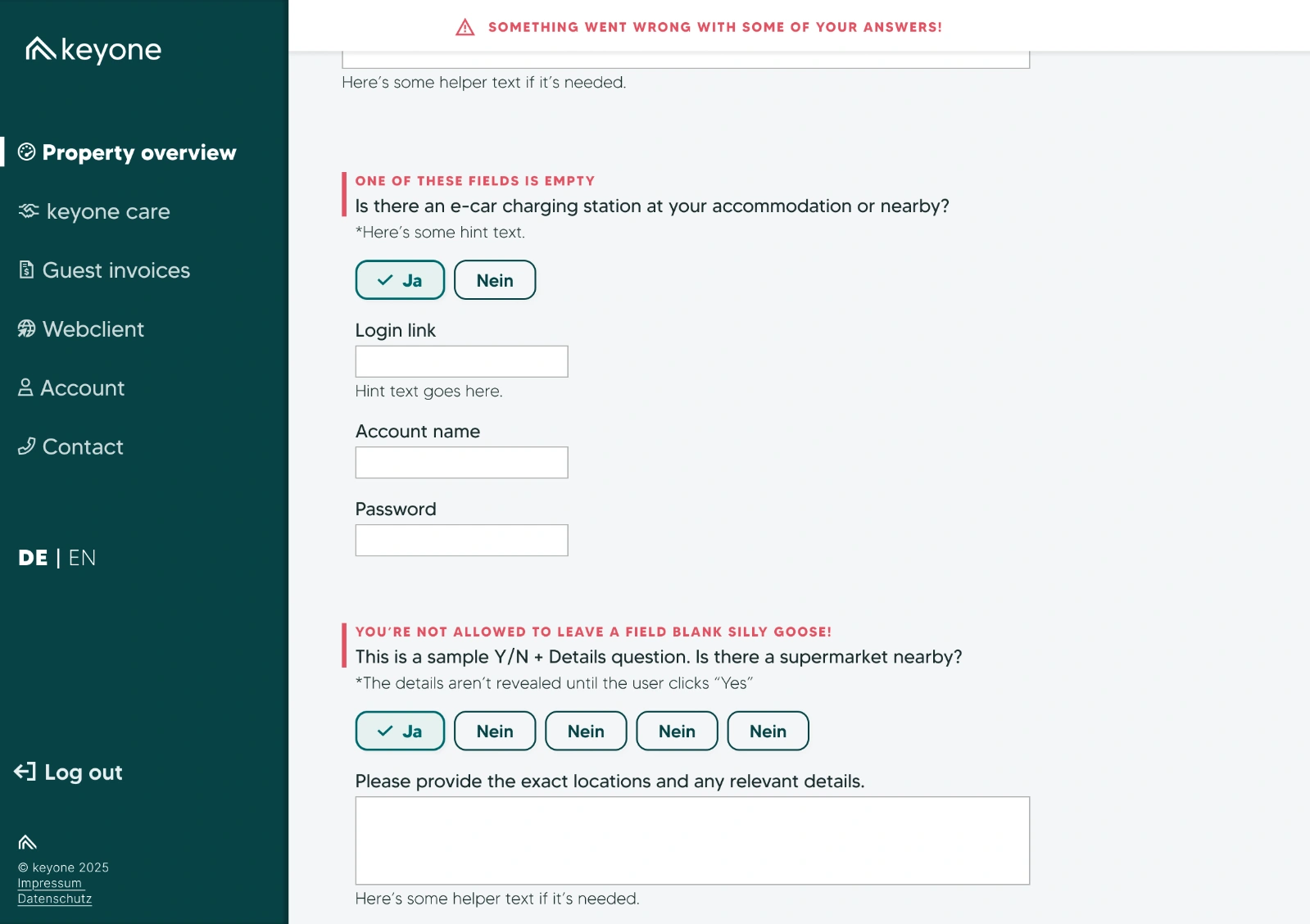
In my designs, an answer with a validation error got a red line beside its question and a short message above it. The wording was left to development, since it depended on how each field was validated, but its job was to say what was wrong, such as a required field left empty or an answer in the wrong format. A banner pinned to the top of the screen flagged that something needed attention, and the save and continue button carried a flag that stopped owners moving on.
The build kept the red line, but dropped the messages and the flag on the button, and the banner sat at the top of the page instead of staying pinned in view. An owner who pressed save at the bottom of a long section stayed where they were. The only clue was a thin red line somewhere above, easy to miss, and the banner that explained it was a long scroll away.
Core: a photo upload with no instructions
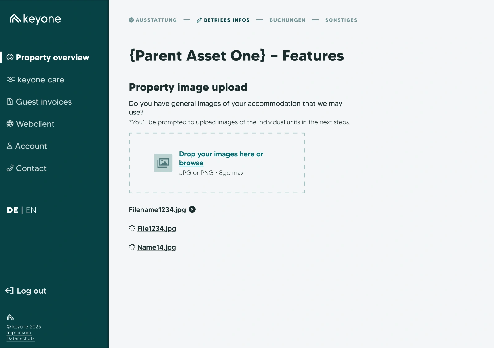
Owners were asked for several photos of each property, but the upload field only took one, with no word on file types or sizes, and no way to remove a photo once it was added. A checkbox let owners say they’d send a Dropbox link instead, with no instructions on what to do with it. That bypass kept owners moving, so it wasn’t critical, but it meant confusion for owners and more work for account managers.
I suggested removing the upload entirely until it was fixed, with a manual workaround in the meantime.
Polish: hint text that took over the question
-
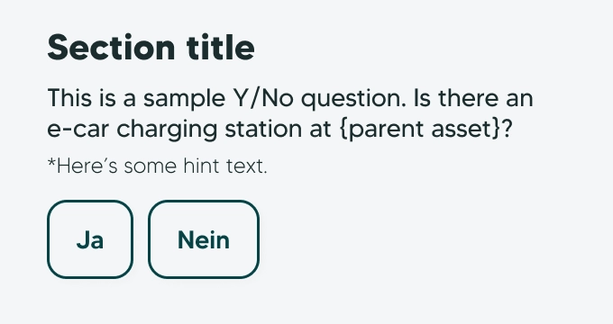
Hint text as designed. I designed hint text as a smaller, quieter line under each question. The build merged it into the question itself, so details meant for edge cases became part of every question. Questions ran long, and while nothing broke, the survey felt heavier than it was.
Cut: the room configuration
The room configuration flow didn’t make it into the build. Its questions were asked as a long run of general survey questions instead, and owners lost the mental model the room cards gave them. It was understandably complex to build, but without it, owners were more likely to lose their place, it took longer, and gaps were left for account managers to fill in by hand.
The designed version is shown under Room by room.
Epilogue
A bigger job than anyone planned for
Where it ended
I handed the audit over in a meeting, walked through the critical issues, and offered to explain or redesign anything that needed it. Soon after, the project was set aside and other priorities took over. Work later picked up again without me, so I don’t know what the host portal looks like today.
What I’d do differently
Find a way to work with development. The only time the developer and I spoke directly was one call during handoff, while the project manager was on holiday, and we both came away saying how good it felt to talk about the product. In that call, we agreed to build the desktop and phone layouts simultaneously, reopening a decision that had already been made. Neither of us saw how much that would add to the build, and it cost me some trust. It was also the last time we spoke directly. If we’d worked together through the build, we might have seen how big the project was getting while there was still time to reshape the MVP.
Build it in smaller loops. The plan was to design the whole first release, develop all of it, then review it. That left every problem to surface at the end, when my audit handed the team 30 to 40 issues at once. My time was stretched across other projects, but if I’d asked to be more involved, we might have found a more iterative rhythm: build a section, review it, fix it, and work around roadblocks as they appeared. Smaller loops would have got the survey in front of owners sooner, and caught problems while they were still cheap to fix.
Closing thoughts
A survey this size is full of tricky UX problems: questions that depend on other answers, child assets that are almost but not quite the same, and rooms that are two things at once. Copying between child assets and the room configuration are some of the work I’m proudest of, even though neither made it into the first build. I’d have liked to see them through.
Next time, I’ll pay as much attention to how the work is structured as to the work itself.
Let’s
talk
If you came here via my CV - my contact details are there, otherwise please reach out to me on LinkedIn (opens in a new tab) or at campbellk70@gmail.com.